Introduction:
We know CTA plays a vital role in achieving our goal either it’s conversion, signup or else. In this blog, you’ll learn ’14 proven hacks to optimize your CTAs’.
What is CTA [ Call to action ] ?
A Call to Action is a concise and action-oriented phrase or button that prompts users to take a specific action.It is a marketing term that refers to the next step a marketer wants its audience or reader to take.
Let’s dive in, 14 best practices to optimize your Click-through rate. Last 4 points are our favorite.
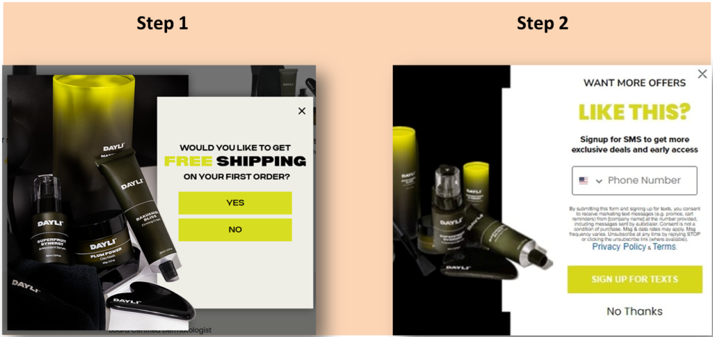
1]Use 2-step CTAs:
A two-step CTA can increase conversions by giving the power of choice to the reader.
Example:
Use a two-step CTA, where the first step is a small action like saying ‘YES’, and the second step is a larger action like entering an email.
2]Use Active Verbs:
Using active verbs in CTA can make it more compelling. Passive language can be weak and less engaging.
Example:
Use active verbs like ”Get, download, register, or , subscribe to create a sense of action and excitement in your CTA.
3]Make it urgent:
Adding urgency to your CTA can increase conversions. When people feel like they have a limited time to act. They are more likely to do so.
Example:
Use words like , now, today, limited time, or act fast in your CTA to create urgency.
4]Place it above the fold:
Putting your CTA above the fold can increase visibility and clicks. People are more likely to click on something that they see immediately.
How to use ?
Place your CTA in the top section of your webpage, where it’s visible without scrolling.
5]Make it specific:
Specific CTAs are more effective than generic ones. People want to know exactly whet they’re getting when they click.
Example:
Be specific about what the user will get when they click the CTA. Instead of ”Learn More, try , learn more about our product features.
6]Use benefit-oriented CTA:
Focusing on the benefits of your offer can be more effective than focusing on the features. People want to know what’s in it for them.
Example:
Use benefit-oriented language in CTA.
7]Keep it short and simple:
A short and simple CTA is more memorable and easier to understand. People don’t want to read a long and complicated message.
How to use?
Keep your CTA to one line and use clear and concise language.
8]Make it personal:
Personalizing your CTA can make it feel more relevant and engaging. People want to feel like you’re speaking directly to them.
How to use?
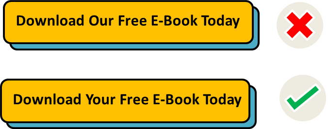
Use personalization , like the person’s name or location, in your CTA. Or use words like ‘You, and your’.
9]Make it actionable:
A CTA should be actionable and specific. People need to know what to do next.
How to use?
Use specific language in your CTA like ‘Download now, or claim your free trial.
10]Add a sense of scarcity:
Creating a sense of scarcity can make people feel like they need to act fast to avoid missing out. People want what they can’t have.
How to use?
Use language that creates a sense of scarcity, like ‘Only 10 spots available, limited stock, get it before it’s gone.
11]Use numbers:
Creating a sense of exclusivity can make people feel special and more likely to act. People want to feel like they’re part of a select group.
How to use?
Use language that creates a sense of exclusivity, like ‘Join our exclusive community today’, or ‘Get access to our VIP membership’.
12]Add a guarantee:
Adding a guarantee to your CTA can reduce the risk and increase trust. People are more likely to take action if they feel confident in their decision.
How to use?
Include a guarantee, like ’30-Day money-back guarantee’ or ‘Satisfaction guaranteed’, in your CTA.
13]Use social proof:
Using social proof in your CTA can make it more persuasive. People are more likely to take action if they see others doing it.
How to use?
Include social proof, like the number of people who have already signed up, in your CTA.
14]Create a sense of Anticipation:
Creating a sense of anticipation can make people excited to take action. People want to feel like they’re part of something special.
How to use?
Use language that creates a sense of anticipation, like ‘Be the first to get access to our exclusive product launch’.
Hope you loved this article, ’14 proven hacks to optimize your CTAs’.
”Wanna take your E-commerce business to the next level with proven email marketing strategies? You’re just ONE step away. DM ‘Klaviyo consultation’ at info@alixemail.com” or cick here to schedule a meeting
Don’t forget to subscribe to our YouTube channel [ Marketing Chamber] for klaviyo tutorials. For Urdu/Hindi klaviyo tutorials, click here. For English klaviyo tutorials, click here”.
FAQs:
1] Can we use these hacks in email marketing flows?
Answer: Yes obviously you can test these hacks in your klaviyo flows like abandoned cart flow, cross-sell flow, upsell flow, expected next purchase flow, abandon checkout flow, browse abandon flow, birthday flow, abandon site flow and more.
2]What is a CTA, and why is it important for my website?
Answer: A Call to Action (CTA) is a prompt that encourages users to take a specific action, such as signing up, making a purchase, or subscribing. It’s vital as it guides visitors toward desired actions, boosting engagement and conversions.
3] How can I create effective CTAs that resonate with my audience?
Answer: Effective CTAs use clear, action-oriented language, provide value, and align with user expectations. Tailor CTAs to the user’s journey and use words that convey the benefit of the action.
4] What role does design play in CTA performance?
Answer: Design matters. Make CTAs visually striking with contrasting colors and ensure they’re easily clickable. The placement, size, and surrounding whitespace influence how noticeable and clickable CTAs are.
5] Can I use urgency in my CTAs, and how does it impact performance?
Answer: Yes, urgency can be effective. Urgent language like “Limited Time Offer” can create a fear of missing out (FOMO), encouraging quick action and potentially improving conversion rates.
6] How do I measure the effectiveness of my CTAs?
Answer: Tracking click-through rates (CTR) and conversion rates is key. Compare the number of clicks on a CTA to the number of completed actions (conversions) to assess performance.
7] What’s the best placement for CTAs on my website?
Answer: Place CTAs where users naturally focus their attention, such as at the end of engaging content or within a sticky header/footer. The CTA’s relevance to the content matters too.


