Introduction:
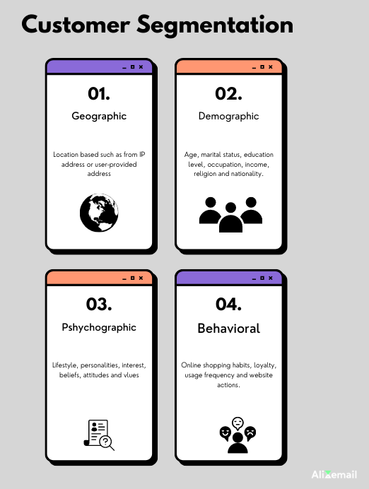
Discover the ultimate guide to designing brilliant emails that stand out in your reader’s crowded inbox. Unleash the power of segmentation, ONE-goal, pyramid pattern, personalization to engage your audience and boost conversions. Explore ’20 proven hacks to design a brilliant email campaign’.- Segmentation: Divide your email audience into smaller, targeted groups based on their preferences, behaviors, or demographics and engagement. This allows you to tailor your content and send the right message to the right audience.
- Personalization: Personalize your emails with the recipient’s name and other relevant details. Customized content creates a stronger connection with the reader, making them more likely to engage with your email.
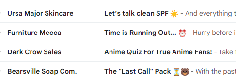
- Subject Lines: Write concise and optimized, persuasive subject lines ( only 5-7 characters) that grab the reader’s attention. A well-crafted subject line urgest the consumer to open the email and look what’s inside.
- Copywriting: Use clear and compelling copy in your email. Avoid lengthy paragraphs and get straight to the point. Use short sentences. Focus on how your product or service benefits the reader.
- Use Simple Pictures: Include images that are simple and relevant to your content. Avoid overwhelming the email with too many visuals, as it may confuse or distract the recipient. Additionally, it will make your email HEAVY and take time to load. Ultimately, engagement will go down.
- Main Focus on One Goal: Send ONE-Goal focused email. Avoid using too many CTAs, which can distract your audience and affect the effectiveness of your message.

- Use One Font: Sync your email with font on your store. If necessary, you can use up to TWO fonts, but using more than that can create visual clutter and diminish the email’s readability.
- Avoid Too Many Promo Codes: Limit the number of promotional codes in your email. Overloading the email with discounts may reduce the perceived value of your offers. The best option is to show the coupon in the header, and it can also be a good choice to display it in the footer.
- Use Headings and Subheadings: Organize your email content with headings and subheadings to make it easy for readers to scan and find relevant information quickly. Doing this, you can grab your reader attention.

- Inverted Pyramid: Structure your email content like an inverted pyramid, with the most important information at the top and leading down to the CTA. This ensures critical details are seen even if the reader only skims the email.
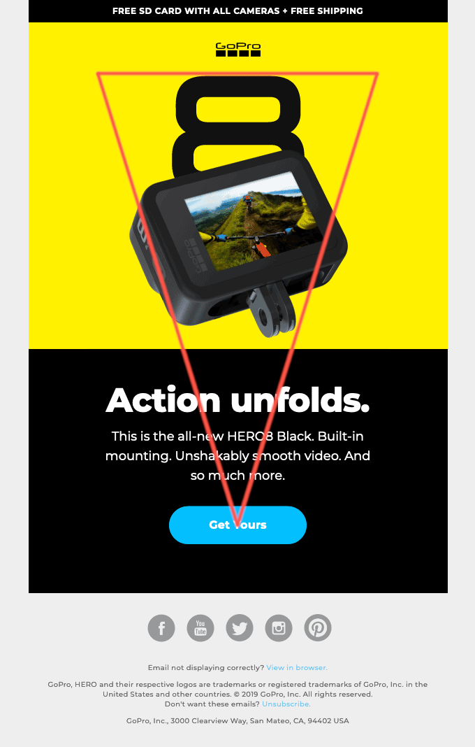
- Zigzag Pictures: Use visuals that guide the reader’s eyes in a zigzag pattern through the email, leading them to your CTA.
- Add White Space around CTA: Create enough white space around your CTA to make it stand out and increase the chances of it being noticed and clicked.
- Use Persuasive Language: Replace generic phrases like “get,” “enter,” and “click here” with more persuasive and action-oriented words like “claim,” “read,” and “try.”
- Use “My” Instead of “Your”: Personalize the CTA by using “my” instead of “your,” making it feel more individualized and exclusive to the reader.
- Direction Cues: Consider using directional cues, like arrows, to draw attention to your CTA or important elements in your email.
- Animated GIFs: Add small, lightweight animated GIFs to make your emails more engaging and interactive.
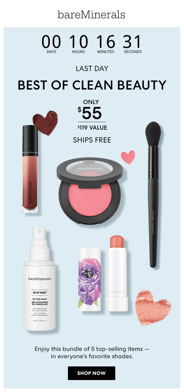
- Create Urgency with Timer: Use countdown timers to create a sense of urgency and encourage recipients to act quickly on your offers.
- Check Mobile Preview: Ensure your email is mobile-friendly and preview how it looks on mobile devices. This’s one of the important aspects to consider as most of the users open email on their cell phone
”Wanna take your E-commerce business to next level with proven email marketing strategies? You’re just ONE step away. DM ‘Klaviyo consultation’ at info@alixemail.com” or cick here to schedule a meeting Don’t forget to subscribe our YouTube channel [ Marketing Chamber ] for klaviyo tutorials. For Urdu/Hindi klaviyo tutorials click here. For English klaviyo tutorials click here”.
FAQs:
1] How can I make my email designs more visually appealing?
Answer: Use simple and relevant images, limit visuals to avoid overwhelming the email, and add white space to highlight important elements.
2] What is the best way to increase email open rates?
Answer: Craft concise and captivating subject lines (5-7 characters) to grab the reader’s attention and entice them to open the email.
3] How can I personalize my email campaigns effectively?
Answer: Incorporate the recipient’s name and other relevant details to create a stronger connection and increase engagement.
4] How can I keep my email content scannable and easy to read?
Answer: Use headings, subheadings, and concise copy to organize information and ensure readers can quickly find what they need.
5] How can I optimize my email calls-to-action (CTAs)?
Answer: Keep the focus on one primary CTA to avoid overwhelming readers, and use persuasive language to encourage action.
6] Is A/B testing necessary for email design?
Answer: A/B testing is crucial for identifying the most effective elements and optimizing your email campaigns for better results.
7] What fonts should I use in my emails?
Answer: Stick to one font for simplicity, but you can use up to three if necessary to maintain readability and visual consistency.
8] How can I create a sense of urgency in my emails?
Answer: Utilize countdown timers and persuasive language to create urgency and encourage recipients to act quickly.
9] Should we send plain-text flow emails or designed ones?
Answer: It depends. For abandon cart flow, abandon checkout flow, birthday flow, browse abandon flow, site abandon flow, next purchase flow, and other flows, you can opt for designed emails. Along the way, A/B test plain text emails to find what suits your brand best.


