What is dark mode?
Dark mode is a display setting that uses a dark color scheme for user interfaces, typically replacing bright backgrounds with dark ones and using light-colored text and icons. It is designed to reduce eye strain and improve readability, especially in low-light conditions. Dark mode has gained popularity across various digital platforms, including email clients and applications.
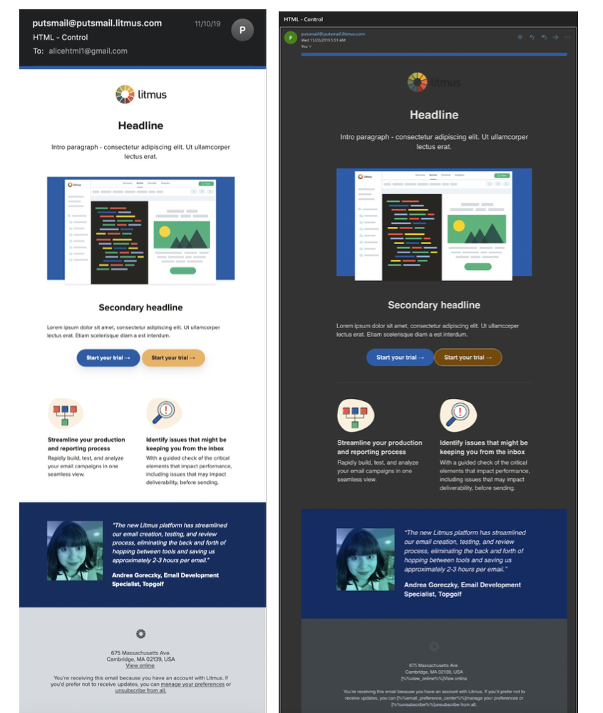
When it comes to email, dark mode can affect the appearance of both the email client interface and the content of the emails themselves. But don’t worry, we’re going to discuss how to create an effective dark mode email.
Litmus’ trends in email engagement report indicates that of the opens tracked, about 34% used Dark Mode as of August 2022, representing steady adoption year over year.
Why people use dark mode?.
- Improved readability: Dark mode often enhances text legibility, particularly for individuals with visual impairments or conditions like dyslexia. The high contrast between the lighter text and dark background can make it easier to read and follow the content.
- Energy efficiency: Dark mode can help save battery life on devices. These display technologies allow individual pixels to be turned off when displaying black, resulting in less power consumption compared to brighter backgrounds. Using dark mode can extend the battery life of smartphones, tablets, and laptops.
- Visual preference: Some people simply prefer the aesthetics of dark mode. The dark background can provide a sleek and modern look, and it may be easier on the eyes for extended periods of use.
- Environmentally friendly: As dark mode reduces the amount of light emitted by screens, it can contribute to reducing energy consumption and, consequently, lower carbon emissions associated with powering electronic devices.
How dark mode affect email design?
- Email Client Interface: Dark mode alters the colors and overall visual design of the email client, such as the inbox, folders, and settings. It typically switches the background color from white or light gray to black or dark gray. Icons, buttons, and text may also change to lighter shades to maintain contrast. The specific changes depend on the email client or application being used.
- Email Content: Dark mode can impact the way emails are displayed to recipients. When an email is viewed in dark mode, the background color of the email body may change, affecting the overall appearance of the message. Images, graphics, and other visual elements might also be adjusted to ensure proper visibility against the dark background. Additionally, some email clients may automatically convert email content to dark mode, overriding the original design.
How to create Dark Mode effective email?
1] Optimize your logo:
What does that mean ‘optimize your logo’? Your logo must be clearly visible even anyone open your email in dark mode. For that make your logo transparent. Use white stroke if your logo is of black color because it looks good in bright mode but invisible in dark mode.
[ Have a look on the image below ]
How to white stroke your black logo?
You can do so even in CANVA.
- Upload your logo
- Make it transparent
- Click on transparent logo and edit image
- Apply shadow
- change shadow color from black to white and that’s it : )
Click here to watch our tutorial from 3:24 to learn how to apply a white stroke.
You can see the logo below clearly, right? That’s because of the ‘white stroke.’ It might be invisible to you, as it is for us, if no white stroke is applied to it.
2] Get your customers preference:
Ask your subscribers or customers about their preference: whether they want to receive your emails in dark mode or bright mode. Create segments based on the collected data and send them emails accordingly. You can accomplish this through a signup form, campaign, or email flow.
3] Crop your image/logo with proper proportion:
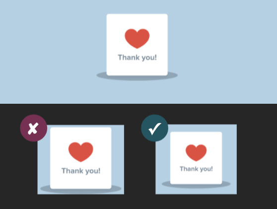
Crop your image or logo properly as it would not awkward in bright mode but in dark mode. So to craft dark/bright mode efficient email, crop them in proper proportion.
4] Check before shooting out your email:
Always double-check your email campaign or flow email before sending it out or making it live. Review your email in dark mode to ensure it is good to go, and make any necessary changes if needed.
5] Plain text:
Using plain text emails can be a useful approach to ensure better compatibility with dark mode. Plain text emails have a simple structure that consists only of text without any formatting or visual elements. As a result, they tend to display well in various email clients, including those with dark mode enabled.
Here are some advantages of using plain text emails to tackle dark mode:
- Consistent appearance: Unlike HTML emails, plain text emails do not rely on styling or formatting that can be affected by dark mode. They maintain a consistent appearance across different email clients, ensuring that the content is readable and visually coherent.
- Lightweight and fast: Plain text emails are lightweight and load quickly, as they don’t contain additional elements such as images or complex formatting. This can improve the overall user experience, especially for recipients using dark mode on slower connections or mobile devices.
6] Extension for you [ FREE ]
Go to your google chrome
Navigate to extension
Search ‘Dark Mode Extension’
OR
Search on google chrome ‘Dark Mode Extention’ [ Easy way : ) ]
or click here to install
7] Keep testing!
Testing helps ensure visual consistency, readability, and accessibility of emails in dark mode. By verifying colors, contrast, text legibility, and image visibility, testing allows for iterative improvements to optimize the user experience and address any specific challenges or preferences related to dark mode usage.
You can test every email with a tool ‘Litmus‘
Hope you loved this blog ‘How to create dark mode efficient email’ : )
PS: Try your best to create every email dark mode efficient either it is abandon checkout flow, thank you flow, expected next order flow, abandon site flow, browse abandon flow or others.
”Wanna take your E-commerce business to next level with proven email marketing strategies? You’re just ONE step away. DM ‘Klaviyo consultation’ at info@alixemail.com”
Don’t forget to subscribe our YouTube channel [ Marketing Chamber ] for klaviyo tutorials. For Urdu/Hindi klaviyo tutorials click here. For English klaviyo tutorials click here.
FAQs:
1] How does dark mode affect email rendering?
Answer:Dark mode can alter the appearance of emails by changing the background color, adjusting the colors of text and graphics, and potentially overriding original design elements.
2] How can I create a dark mode-efficient email?
Answer: To create a dark mode-efficient email, consider using high contrast color combinations, testing your email in dark mode, optimizing images for visibility, and ensuring responsive design to adapt to different display modes.
3] Do I need to create separate emails for dark mode and light mode?
Answer: It depends on your specific requirements and the email clients your recipients use. While some email clients automatically convert emails to dark mode, it’s recommended to design emails that work well in both light and dark modes to ensure a consistent experience for all recipients.
4] What are the benefits of using plain text emails for dark mode?
Plain text emails can be beneficial for dark mode as they are highly readable, maintain a consistent appearance, load quickly, and are accessible. They can ensure a reliable and legible experience for recipients using dark mode.
5] Should I avoid using images in dark mode emails?
It’s not necessary to avoid using images entirely, but it’s important to optimize them for visibility in dark mode. Ensure images have sufficient contrast and consider providing alternative text or descriptions to maintain accessibility.
6] How can I test my emails for dark mode compatibility?
You can test your emails for dark mode compatibility by previewing them in email clients that support dark mode or using testing tools that simulate dark mode environments. This helps identify any formatting issues or readability concerns specific to dark mode.
7] What are some design considerations for dark mode emails?
Answer: Design considerations for dark mode emails include using appropriate color contrasts, avoiding relying solely on color to convey information, adapting background colors, ensuring legible text, and maintaining a visually appealing and consistent experience.


