Benefits to use signup form:
A signup form is also known as Optin form to get leads of those interested in your business or products. Some of the many important benefits of signup form are mentioned below:
- Contact information: A signup form allows you to collect contact information, such as email addresses, from customers who are interested in your products .
- Personalized Marketing: Collect your prospects interests, demographic info, preferences and more to take personalization in your messaging to next level.
- Offer reminder: By creating segment specified signup form, offer exclusive giveaways to your VIPs.
- Abandoned Cart Recovery: A signup form can be utilized to capture email addresses when customers abandon their shopping carts. Then send targeted emails to remind customers about their abandoned items, offer incentives or discounts, and encourage them to complete their purchase.
- Targeted Promotions and Sales: Having a signup form enables you to notify customers about upcoming promotions, sales, or new product launches via email.
- Customer Feedback and Reviews: The signup form can include options for customers to provide feedback or leave reviews. By capturing this valuable information, you can gather insights about customer satisfaction, identify areas for improvement, and showcase positive reviews on your website or product pages, thereby building trust and credibility with potential customers.
Types:
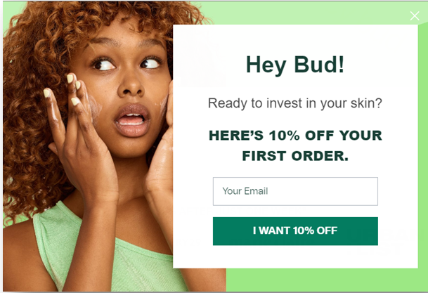
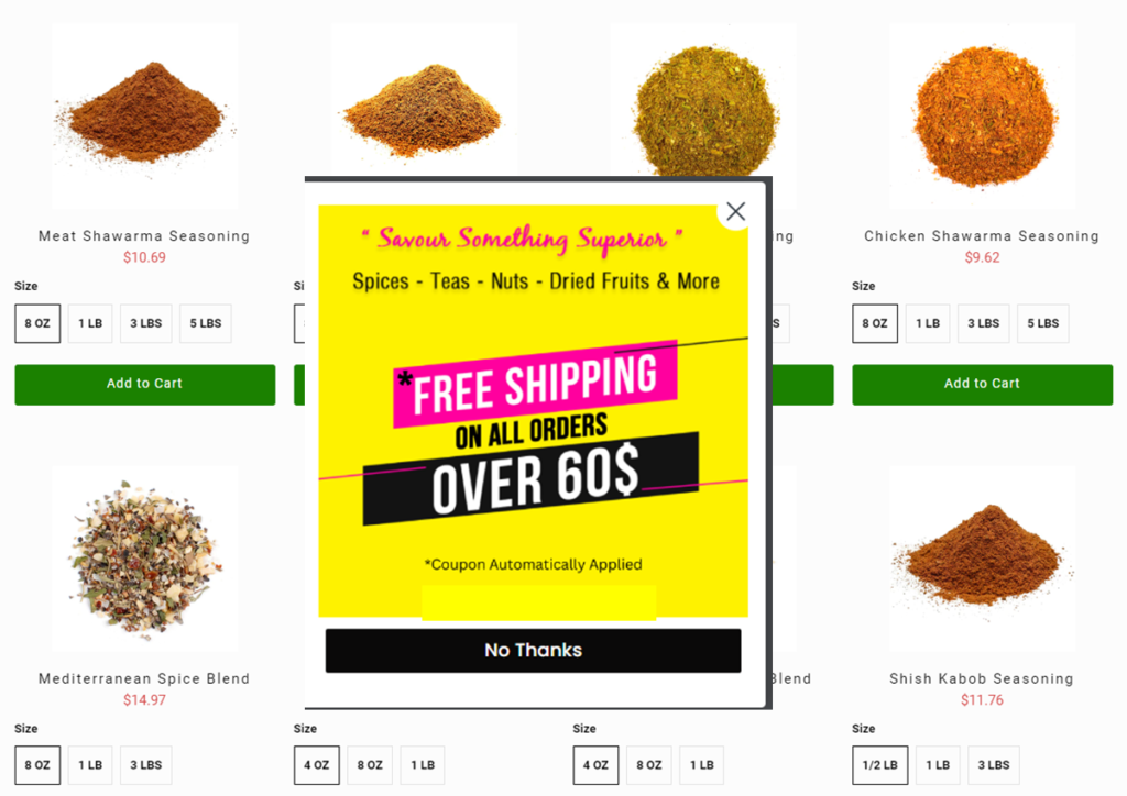
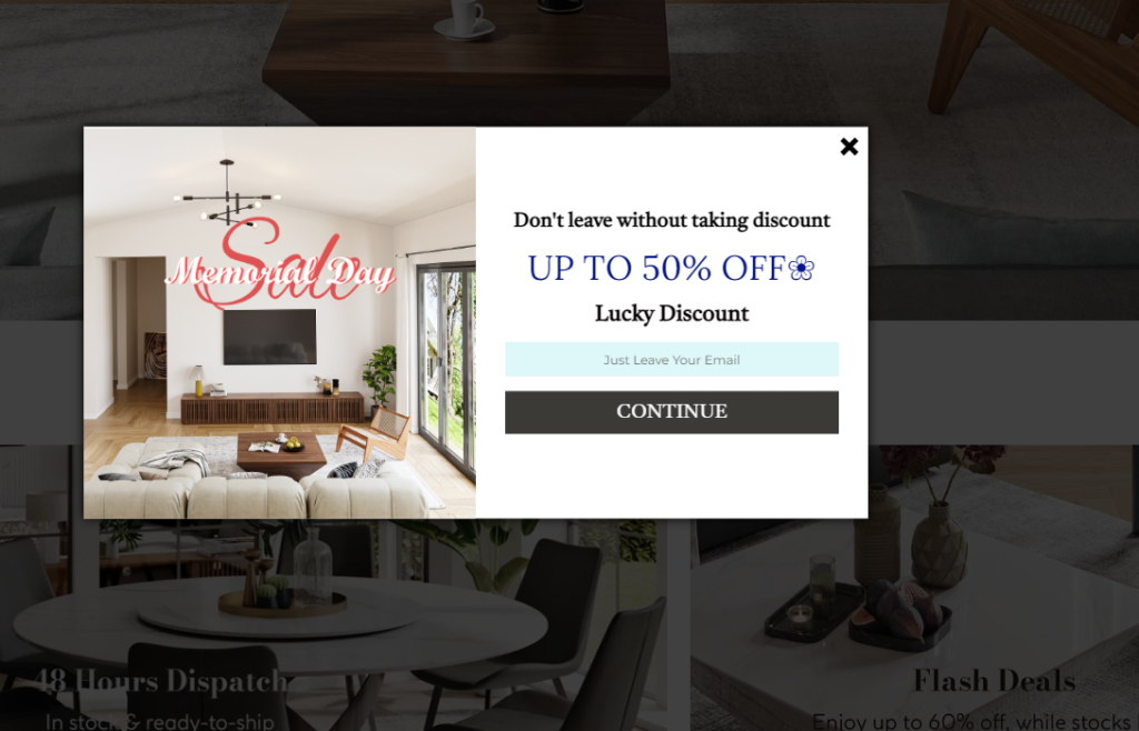
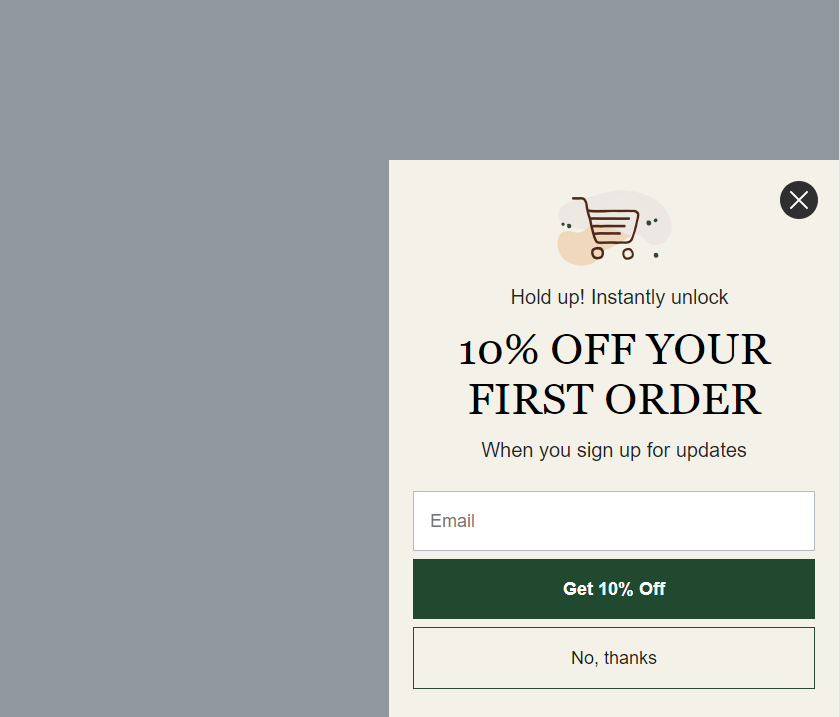
- Popup Signup Form: A popup signup form is a small window that appears on a website, often in the center or corner of the screen, prompting visitors to enter their information and join an email list or subscribe. It grabs attention by overlaying the main content temporarily.
- Flyout Signup Form: A flyout signup form is a compact form that slides or expands from the side or bottom of your store. It offers a less intrusive alternative to popups and allows visitors to quickly provide their details without disrupting their browsing experience.
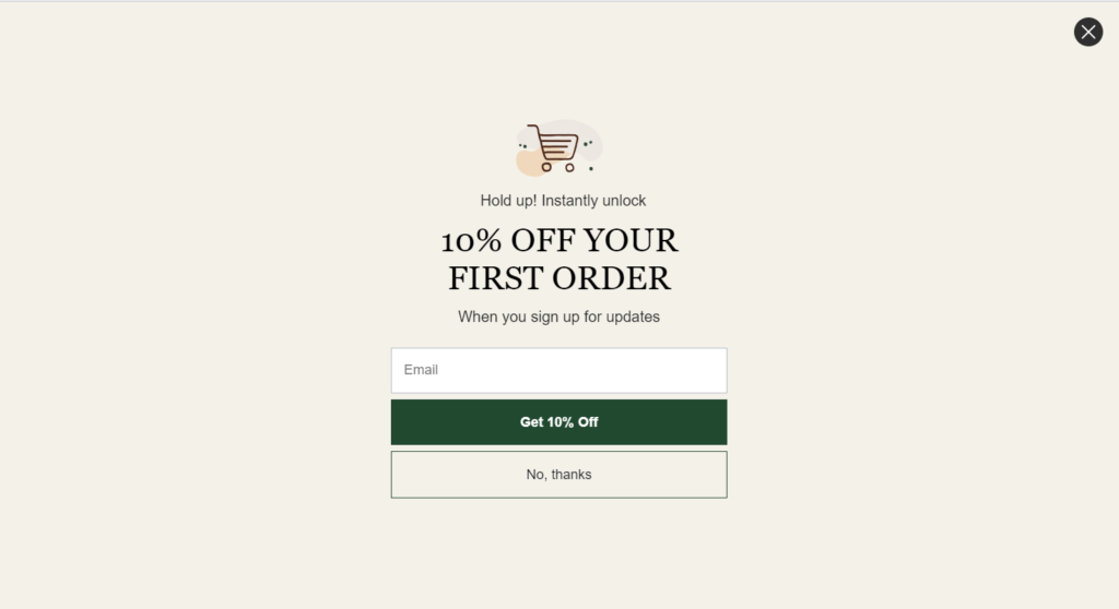
- Full Page Signup Form: A full page signup form takes over the entire screen, temporarily hiding the underlying content. It provides ample space to capture more detailed information from visitors, such as names, addresses, and preferences, often used for comprehensive subscription or registration purposes.
- Embedded Signup Form: An embedded signup form is placed directly within the content of a webpage. It seamlessly blends with the design and layout, allowing visitors to subscribe without being redirected to a separate page.
How to create signup form in klaviyo?
Follow the following steps:
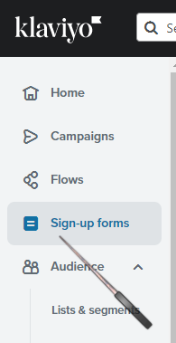
Go to signup form option from left side klaviyo options
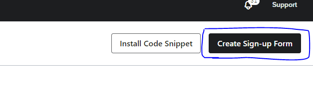
Create signup form
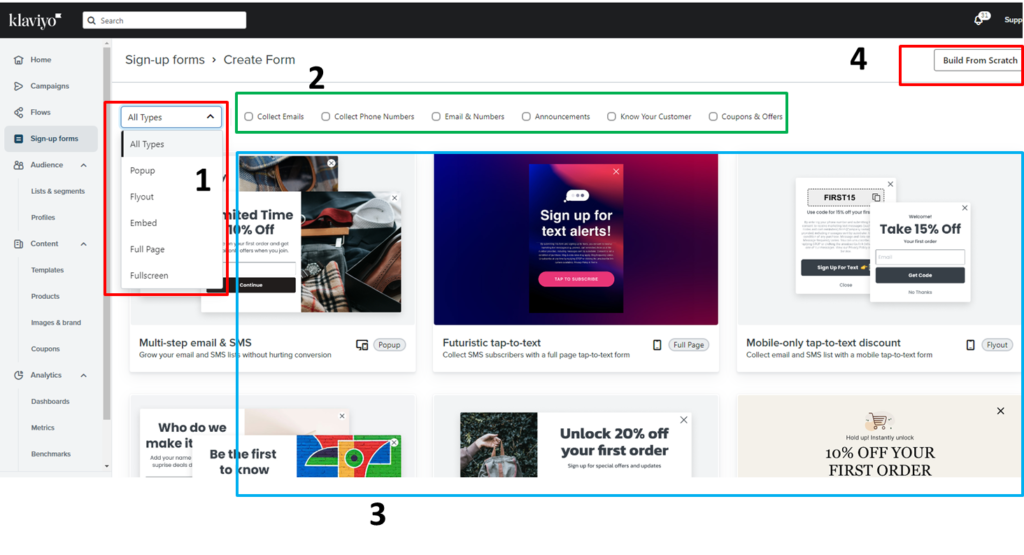
Then you will see new dashboard with different options.
- Option [1] reveals different types of sign-up forms for you to choose from, such as popup, flyout, full page, and embed.
- Option [2] displays the available options for eye-catching sign-up forms based on the information you want to collect. Check the ‘Collect Email’ box if you only want to acquire email addresses. Also, select ‘Collect Phone Number’ if you require that information as well.
- Option [3] presents various built-in Klaviyo sign-up form templates. You can effortlessly use any of them and customize them to your liking.
- Option [4] allows you to build a sign-up form from scratch. If you feel that the built-in forms don’t fit your brand, the option to create a form from scratch is available to you.
Create signup form from scratch:
Navigate to ‘build from scratch’ option
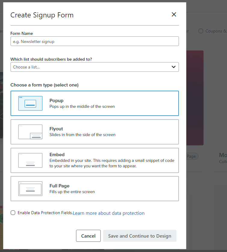
You will see new options, as depicted in the image below.
- Form Name:
Give your signup form a name of your choice.
- Which list should subscribers be added to?
Select the desired list from the dropdown menu where you want to capture your leads. Ensure that the same list is attached to the signup form and welcome flow if you plan on sending welcome emails to your new subscribers.
- Choose the form type:
Select the type of signup form you prefer to proceed with. You can choose A/B type signup forms, as flyout works well for some scenarios while popup works well for others.
- Enable data protection fields:
To make your signup form compliant with GDPR (General Data Protection Regulation), check the box labeled “Enable data protection fields.” Learn more about this option here.
”save and continue to design”
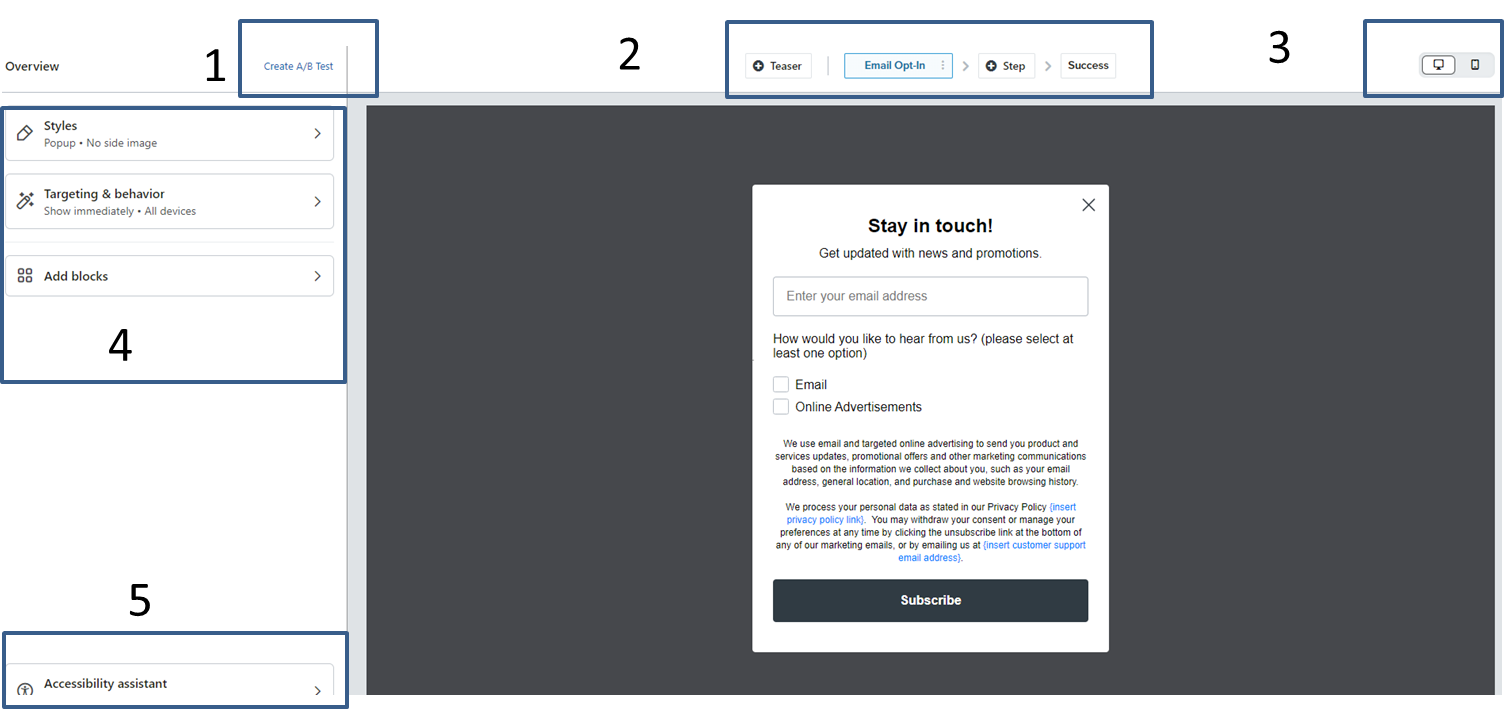
You would be redirected to new dashboard with different options to make your form customized and eye-catching.
- Option [ 1 ] : To create A/B test of your signup form, use this option. You can A/B test type of form, color of your CTA, signup form copy, offer e.g
- Option [ 2 ] : + Teaser > Use this option to create teaser for your form that will appear before or after your form close [ You specify what you need in teaser setting ]
Email Opt-in to get email address and you can add more step by clicking on + Step option. Success page will show to your leads after they submit their info you require in your Opt-in.
- Option [ 3 ]: To preview your signup form on desktop and cell phone, use this option. Click on desktop to preview on desktop and same for cell phone.
- Option [ 4 ]: We are about to discuss in depth all these option [ Styles, Targeting and behavior , Add blocks ]
- Option [ 5 ]: Accessibility assistant: This is klaviyo new update came in just few days or weeks ago. You can read in detail about this update HERE>
Styles:
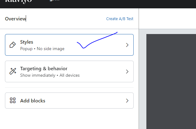
Lets talk about Style option you see in top left corner.
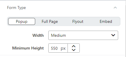
Form type:
- Type:
Here you have to chose which type of signup form you are going to set. Popup/Flyout/Full page/Embed. Suppose you want popup. Click on Popup from given options.
- Width:
Select ‘WIDTH’ of signup form from dropdown.
1] Small 2] Medium 3] Large 4] Custom
- Minimum Height:
Adjust height of your Opt-in by increasing or decreasing the number depending on your signup form copy, opt-in options e.g
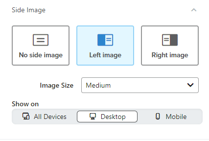
Side Image:
Lets jump in for next option that is side image. You can add left or right side image if you need to. Side image is best to go for desktop as cell phone users cannot see side image. Would be better to not use side image to making your form cell phone and desktop optimized.
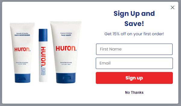
Upload image from your store after navigating to left or right side image. [ Below is the signup form with left side image ]
- Image Size:
1] Medium 2] Small 3] Large
chose any of these size form dropdown to fit your store picture in your signup form.
- Show On:
Cell phone users cannot see the side image if you specify “Desktop,” and vice versa if you choose “Mobile.” Keep in mind that including a side image will disrupt your form design if you select “All devices.” The form copy and options will become difficult to read, resulting in reduced conversion rates and potential damage to your brand’s reputation
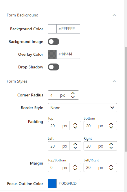
Form background and Form styles:
To modify the colors and text for your signup and input fields, navigate to the respective section and customize them according to your preferences.
Testing and behavior:
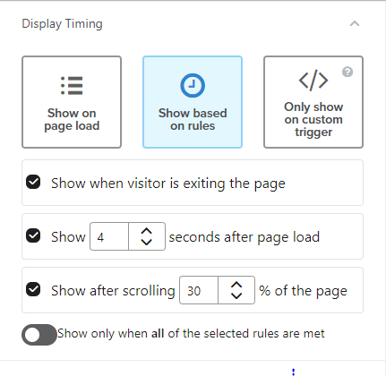
In this section, there are THREE options to display your form
- Show on page load
- Show based on rules
- Only show on custom trigger
♦Show On page load:
Your signup form will appear to your store traffic as soon as your store load. Suppose your store takes 4 seconds to load all its components then Opt-in will popup after 4 seconds.
But it may irritate your store traffic if you show your form just as they landed on your store.
♦Show based on rules:
Under this option, there are further THREE options
→Show when visitor is exiting the page [ store ]:
Check this option [ 1st option ] to show your form when someone exiting your store after going through of it. We can call it exit-intent form.
→Show after X seconds after page load:
Specify the time here that when you want to show your signup form. Mostly 5-10 seconds are good to go. It may vary for you also so can A/B test.
→Show after X% of page load:
Please specify at what percentage of your store loading the signup form should appear. Suppose you want to show your signup form after 30% of page then write down 30 after checking 3rd option.
”Note the switch that appears beneath the delay options allowing you to ”Show only when all of the selected rules are met”. If you choose multiple delays, all must be satisfied in order for the form to appear. For example, if you select exit intent and set the form to display after someone scrolls midway through the page, a visitor needs to complete both actions (scrolling halfway down the page, then showing exit intent) in order for the form to appear.”
♦Only sown on custom trigger:
This option is for you if you want to showcase your form based on any condition, such as on a button click or in your own code.
Read more about custom triggered signup form here
Display frequency of signup form in klaviyo:
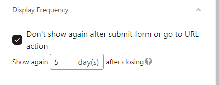
Check the box to not show your signup form again after someone submit your form took the action you needed from them.
There is another option as : Show again X Days after closing
Here you can mention 5, 7, 14 or any other number what suit your brand.
When you mention 5 days after closing means if any profile saw your signup form and close it without filling in information. And same profile again came to your store within 5 days, he/she will not see any form. But if come after 5 days, same signup form will appear there.
Devices:
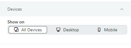
You can take leverage of this option to set up cell phone and desktop optimized signup form separately. Means if you have separate forms for cell phone and desktop then select option accordingly [ cell phone for cell phone optimized form and desktop for desktop optimized form] . But if you have only ONE form but it is cell phone and desktop optimized. Check ‘All devices’ option.
Dismissal:
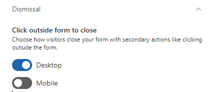
Do you want to close your form when someone click outside? Enable both options if want this for both types of devices. It is suggested to toggle off for cell phone. As while scrolling on cell phone, usually we click outside so your form will be closed but may be your prospect wishing to opt-in for your brand. Just ensure to show CLOSE [ Cross ] button clearly.
Targeting:
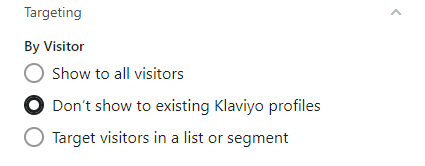
Define the audience you wanna target with signup form. To hit existing profiles [ whose email addresses you have in klaviyo] and new prospects on your ecommerce store , check 1st option ‘ Show to all visitors ‘.
Check ‘Don’t show to existing klaviyo profiles’ to target ONLY new visitors on your store.
You can also take the benefit of 3rd option ‘ Target visitor in a list or segment’ to target specific group of existing klaviyo profiles based on their activities.
By URL:
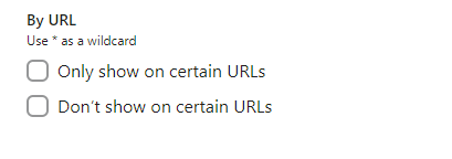
You have the option to set up where your form appears on different URLs. Use the “Only show on certain URLs” feature to choose specific URLs where you want the form to be displayed. Conversely, you can use the “Don’t show on certain URLs” feature to select the URL(s) where the form should be hidden.
For each setting, you can toggle between “Containing” and “Exactly Matching.”
When you choose “Containing,” the form will be displayed on any URL that contains a part of the value you input. For example, if you input “Containing www.klaviyo.com/,” the form will appear on URLs like www.klaviyo.com/blog, www.klaviyo.com/features, and similar ones.
On the other hand, selecting “Exactly Matching” allows you to target one specific URL. For instance, if you input “help.klaviyo.com/The-Signup-Form-Builder,” the form will only appear on that exact URL and will not include variations like “https://help.klaviyo.com/The-Signup-Form-Builder”.
If you select Exactly Matching, be sure to include the correct protocol (e.g., http:// or https://) at the beginning of your URL.
By Location:
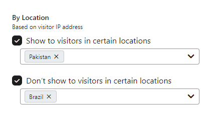
You can choose to show or not show a form to visitors based on their location. Klaviyo uses each site visitor’s IP address to determine whether they meet the criteria. This may be useful if, for example, you want to include specific data protection language for people in the EU, but do not want browsers in another region to see the same information. Example: Suppose we want to showcase our form only in Pakistan but not in Brazil
PS: Wanna generate 25-30% more revenue through proven email marketing strategies? DM ‘FREE Klaviyo consultation’ at info@alixemail.com
PPS: How you can forget to subscribe our YouTube channel [ Marketing Chamber ] For English klaviyo tutorials click here and for Urdu/Hindi klaviyo tutorials click here

