Introduction:
As we know, mobile devices have become an extension of ourselves, creating an optimized cell phone form is crucial for businesses aiming to capture user attention and drive conversions. A well-designed form not only entices users to engage, but also ensures a smooth and frustration-free experience. In this blog, we’ll explore how to optimize cell phone signup form for seamless user experience.
Let’s dive in!
Click here to learn how to create signup form in klaviyo.
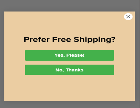
Show your form Teaser first:
Grab your audience’s attention by using an enticing teaser that compels them to click on the form. This will not only enhance user engagement but also save your SEO efforts, as it encourages users to voluntarily check out the signup form.
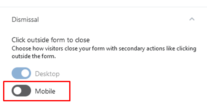
Turn off option ‘click outside to close the form’:
On mobile devices, accidental clicks outside the form can lead to frustration for users who were genuinely interested in the offer. By disabling this option, you ensure a smoother user experience, especially while scrolling on cell phones. What you can do , show clear CROSS option on your signup form.
Single column layout:
Optimize your cell phone form by using a single-column layout. This design choice not only keeps the form clean and simple but also makes it easier for users to fill out the required information without unnecessary distractions.
Multistep for more options:
For longer or more complex forms, consider implementing a multistep approach. Breaking the form into smaller, manageable sections can enhance user experience, reducing the likelihood of form abandonment and encouraging users to complete the entire process. For example if you want to collect more information like your visitor first name, last name, email, phone number, their interest then multistep signup form in klaviyo is for you.
Click-to-text for SMS consent collection:
Integrating a click-to-text option in your cell phone form allows users to provide SMS consent with a single tap. This streamlines the process and improves user convenience, increasing the likelihood of users willingly sharing their contact information.
Use overlay or shadow:
Employ overlays or shadows to visually separate the form from the rest of the website or store. This technique ensures that the form stands out, captures attention effectively, and doesn’t blend into the background, making it more likely for users to notice and interact with it.
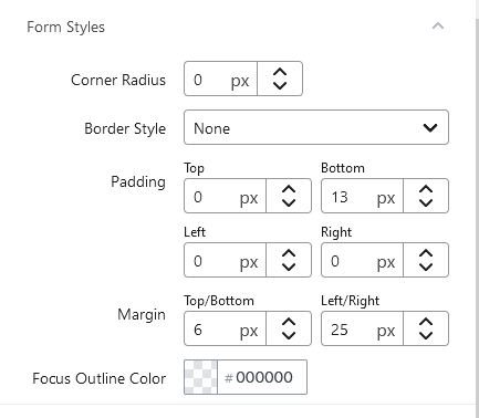
Add left and right margins:
By adding a sufficient amount of margin on the left and right sides of the form, you create a visually pleasing and balanced layout. This prevents the form from appearing cluttered or squeezed into the edges, improving overall aesthetics and user experience.
Incorporating these optimization strategies will not only enhance the functionality and attractiveness of your cell phone form but also contribute to higher user engagement, increased conversion rates, and a more positive brand image.
Hope you loved this article ‘Optimizing cell phone signup form for seamless user experience’.
”Wanna take your E-commerce business to next level with proven email marketing strategies? You’re just ONE step away. DM ‘Klaviyo consultation’ at info@alixemail.com” or cick here to schedule a meeting
Don’t forget to subscribe our YouTube channel [ Marketing Chamber ] for klaviyo tutorials. For Urdu/Hindi klaviyo tutorials click here. For English klaviyo tutorials click here”.
FAQs:
1] How can I make my cell phone signup form more appealing?
Answer: To make your cell phone signup form more appealing, use eye-catching teasers or headlines, incorporate attractive visuals, and ensure a clean, single-column layout for easy navigation.
2] Is it necessary to have a multistep form for a mobile device?
Answer: While it’s not mandatory, a multistep form can be beneficial for longer or complex sign-up processes. Breaking the form into smaller sections keeps users engaged and reduces form abandonment.
3] What’s the importance of disabling ‘click outside to close’ option in the form?
Answer: Disabling ‘click outside to close’ prevents accidental form closure, ensuring users have a seamless experience while scrolling and interacting with the form.
4] How can I collect SMS consent through my cell phone signup form?
Answer: Implement a click-to-text feature that allows users to provide SMS consent with a single tap, simplifying the process and improving user convenience.
5] Why should I use overlays or shadows in my cell phone form design?
Answer: Overlays or shadows visually separate the form from the rest of the website, drawing users’ attention to the form and enhancing its prominence.
6] Should I add left and right margins to my mobile form?
Answer: Yes, adding left and right margins creates a balanced layout, preventing the form from feeling cluttered and improving overall aesthetics.
7] What are the best practices for optimizing a cell phone signup form?
Answer: Best practices include using simple designs, implementing clear call-to-action buttons, making the form easy to fill out, and ensuring it is mobile-responsive.


